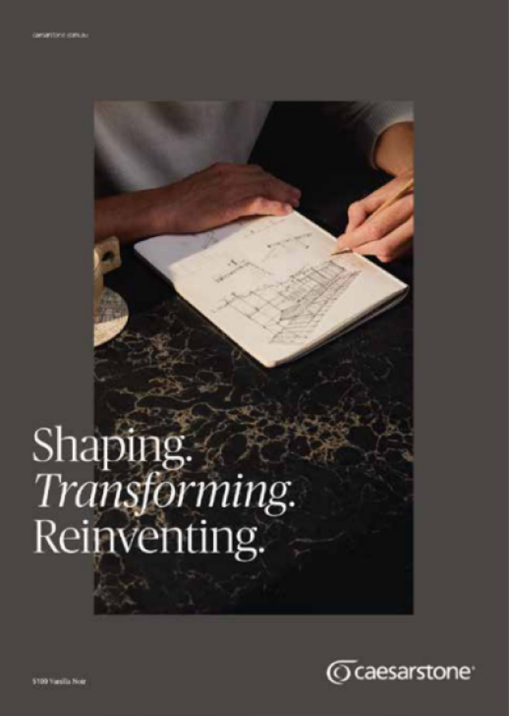
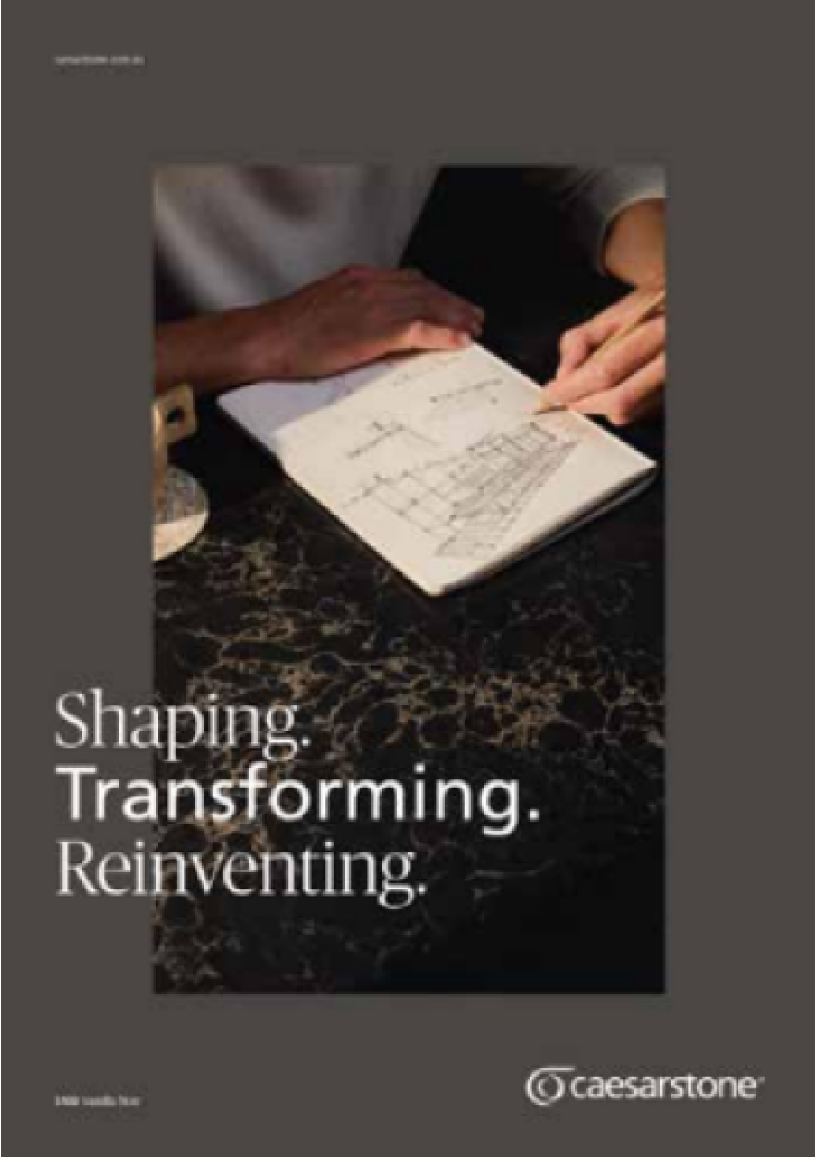
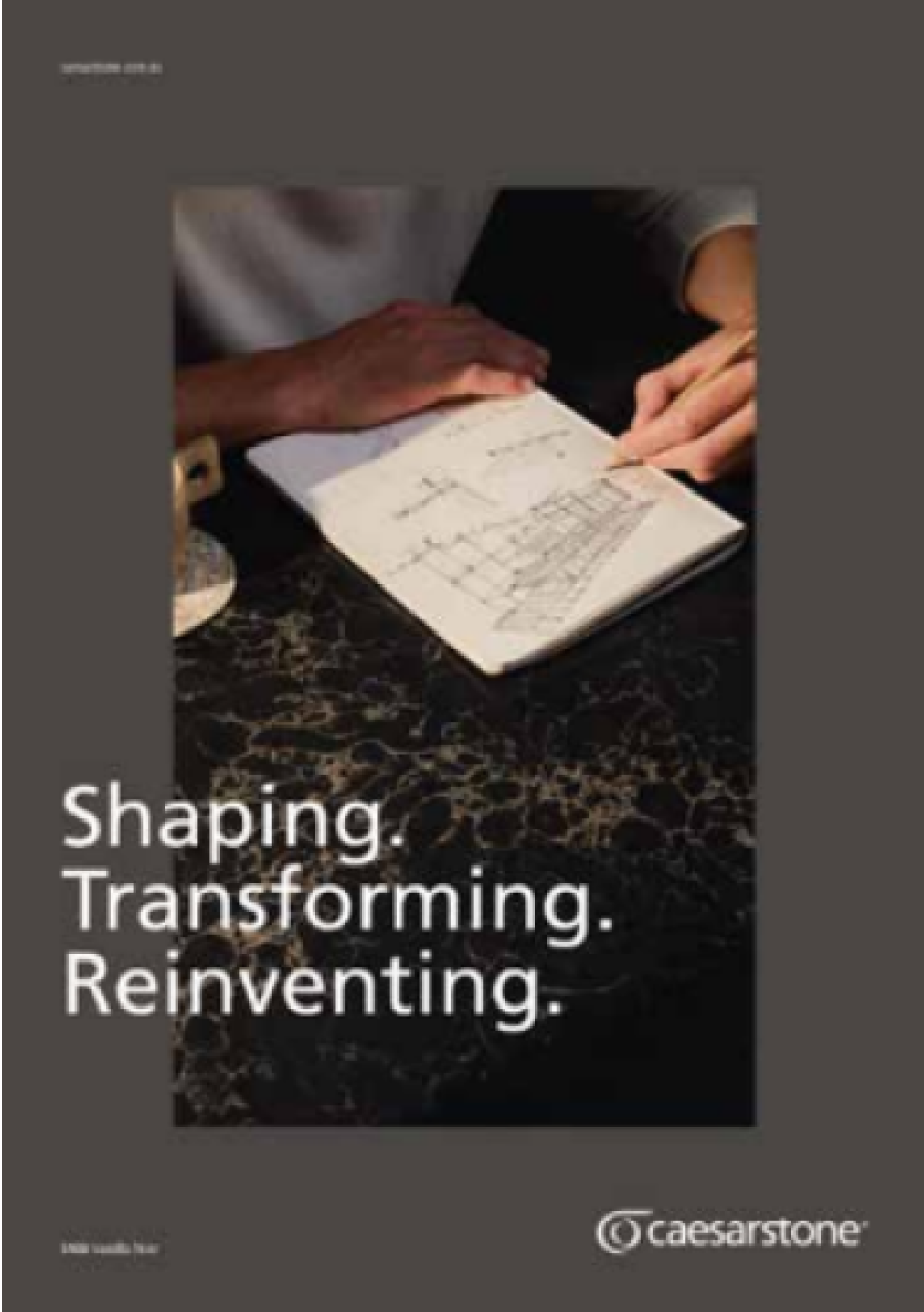
Corporate typography

The concept of Caesarstone brand of Self  expression x trusted authority makes the  typography use a great tool to reinforce that. The Publico family speaks to the Expression and the Frutiger family is more about authority.

Use License
To purchase the usage license, go to:
commercialtype.com
linotype.com

Publico and Frutiger fonts are licensed for use by Caesarstone designated employees only. Partners and external users must obtain their licenses independently. For detailed usage terms, please ask the global marketing HQ. Please ensure compliance with licensing terms to maintain brand integrity.

System typography

When it is not possible to use institutional fonts, we can opt for a combination of Tahoma and Times New Roman as supporting fonts. Since they are native to different operating systems, they should be used in programmed materials in HTML, such as email signatures, or in documents that will be opened by third parties, such as spreadsheets and presentations.

Recommended to replace the use of Frutiger.

Recommended to replace the use of Publico.

Type hierarchy

A text becomes clear and visually organized when we take advantage of different weights, sizes and treatments. We can use the following example as inspiration to create new pieces:

Type composition

To maintain great readability and cohesion between layouts, the type should be used as suggested in the example.

Only one line/word as an italic highlight.

Do not use two lines with italic highlights.
Do not use Frutiger mixed with Publico.

Type metrics

The type metrics should be used correctly to respect the leading and kerning like shown on the example.

Type universe

Best practice

INSIDE THE RECTANGLE
The typography should be applied inside the rectangle when it is a main element on the layout, as shown in the example.
OVERLAPING WITH PICTURES
When we have more elements on the layout, the typography can overlap the pictures.
CENTRALIZED AS PROTAGONIST
When we have a short and strong message to communicate we can use the typography on top  of a stone sample like shown on the example.

Incorrect use

In addition to ensuring that the text is readable, we must also take some care when using typography.

Do not replace the corporate typography.
Do not stretch type.
Do not apply against complex background.
Do not apply multiple styles at the same text.

Accessibility

A composition becomes richer and better structured when we combine different colors. Therefore, respect the recommended contrasts to maintain the readability and accessibility of the text, ensuring good reading and viewing.

REF.:

AAA Contrast refers to a significantly high contrast level recommended to make content more accessible to everyone, following the WCAG recommendations established by the W3C.

Avoid using color combinations with low contrast.