A white canvas to express who we are.
A frame for life.

Caesarstone’s rectangle is the most simplified representation of its products as solid as a stones carved into the perfect dimensions: The Golden Ratio. This unique proportion allows the brand to increase recognition in any materialization.

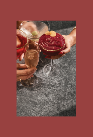
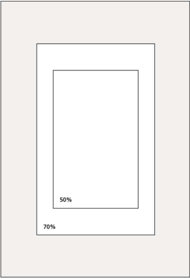
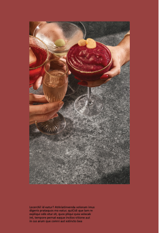
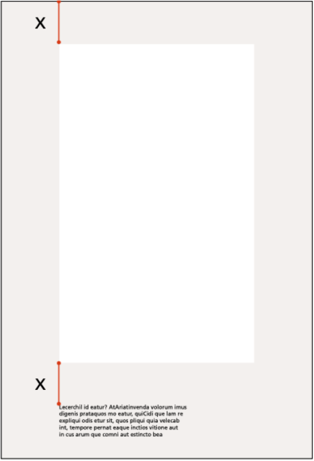
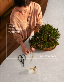
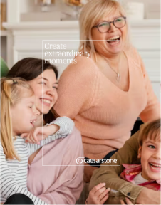
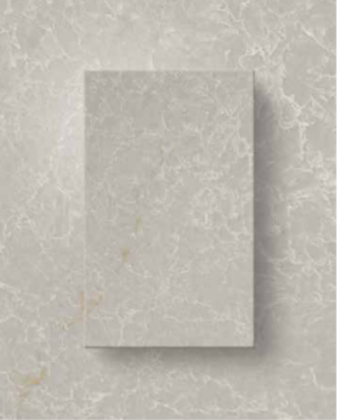
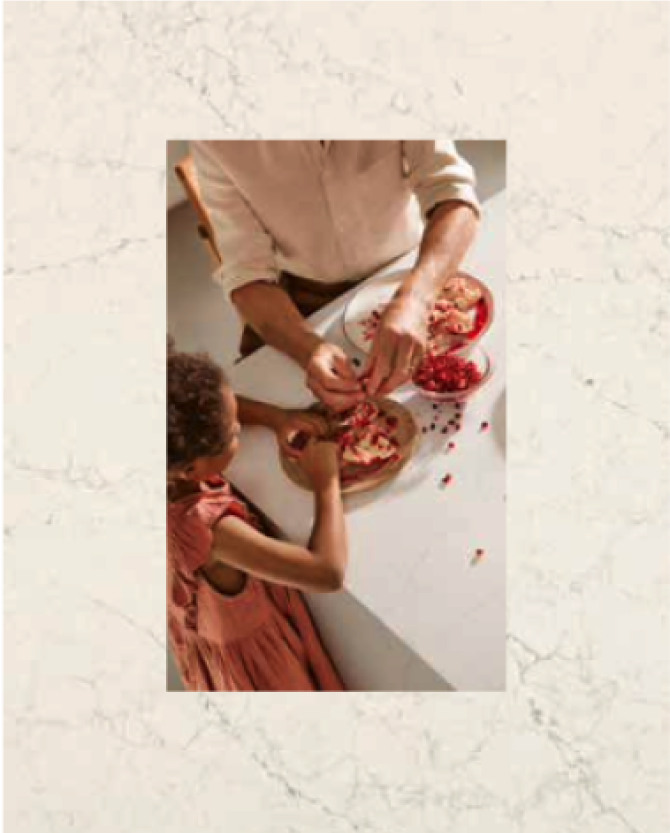
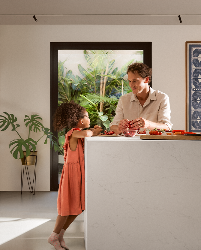
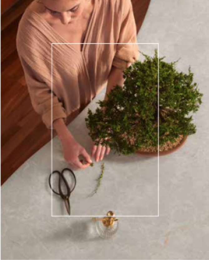
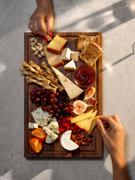
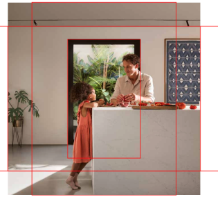
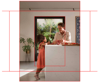
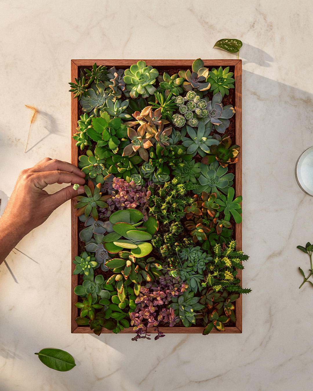
The Rectangle Construction

It will be the main element of our narrative. Highlighting and framing.

Making our products iconic always relevant, as a medium for the experience happen.

Represented directly or indirectly, but always present in the house and in life.

1. Perfect square
2. Height X 1,618
3. Final proportions

Logo Placement

For the logo placement inside the rectangle, we should follow the exemple. The center of the Caesarstone symbol should be on the center of the rectangle as well, respecting the safe margin as shown here.

Stroke size is half size of Caesarstone logo stems like shown on the example.

SMALL SIZES APPLICATIONS
Only for small sizes like social media posts, we are allowed to center the logo on the rectangle. This way we have more brand presence even on reduced size artworks. The safe margin still need to be respected.Stroke size is just the same size of the stem of Caesarstone logo like shown on the example.

Layout Variations

There are 5 layout variations to maintain the rectangle usage while keeping the variety of layouts.

To know which one to choose you can consult the Caesarstone marketing team.

PRODUCT SHOWCASE
This layout is simple and shows the slab right on the center with overlapping text and a subtle drop shadow.
MASK
To use the rectangle as a mask, just center it on the layout and apply the photography inside the rectangle.
SCENE INTEGRATED
The rectangle could go with the scene as a window, curtains or anything that can be shaped as the Caesarstone rectangle.
OUTLINE
The rectangle can go as an outline overlapping the photography to highlight something and have the information inside.
TOP SHOT
The rectangle can be used as a
group of elements forming a rectangle shape.

Rectangle Presence

We have basically front shots when we have the presence of the rectangle on the photography. The rectangle must be clear and frame the people on the photography.

When we have the rectangle integrated with the photography (like in the example) we can use the special grid to center properly the rectangle in the layout.

Place the grid and the picture, position the rectangle in the middle and crop on the desired dimensions.

Frontal/Lateral
Rectangle presence

Place the picture and the grid with the retangle aligned.
Crop the margins according to the layout orientation.

Rectangle Top Shot

The rectangle top shots and basically compositions of any kind forming the centralized rectangle shape. Avoid using too complex elements on the composition and things that do not relate to sophisticated subjects.

Frontal/Lateral
Angles

Rectangle Proportions

The size of the rectangle can vary according to the layout, we can go from 50 to 70% then adjusting to the grid like shown on the example.

For formal media we can go with centralized rectangle but for a layout that we want more versatility it is recommended to use 2 or 3 rectangles to make it more dynamic.

GRID
Rectangle with text block

Incorrect use

To maintain visual cohesion, avoid photos that do not follow the directions provided in this brand center.

On the other hand, we highlight some errors that may be recurring.

Do not use the rectangle in different proportions or orientation.
Do not tilt the image.
Do not use the rectangle with rounded corners.
Do not use photos that are outside the photographic style indicated in this guide.