Logo Color
Variations

The logo should be applied in mineral black against soft white and light colors background. While the soft white version of the logo should be used on dark colors background.

And as a secondary option we can have a soft white logo applied on Terracota background as displayed on the example.

IMPORTANT

The old logo version with 2 colors should never be used under any circumstances.

IMPORTANT

The old logo version with 2 colors should never be used under any circumstances.

Reductions

To ensure the right application of the logo in reduced sizes, we stablished a minimum reduction that must be 3cm for printing or 140px for digital.

Protection area

To guarantee the integrity and legibility of the brand, respect the indicated protection area on the example.

Co-branding
(together)

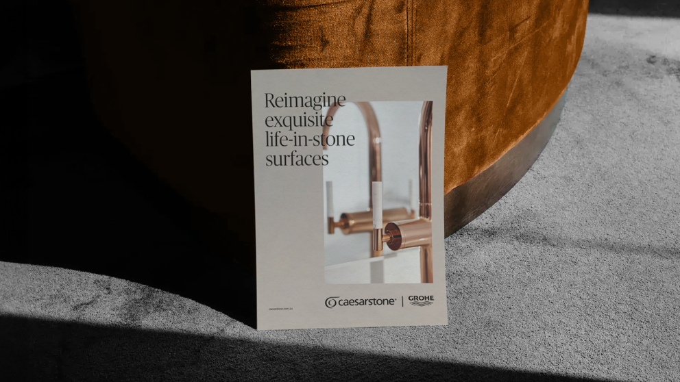
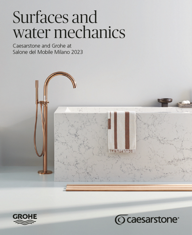
To guarantee the integrity and legibility of the brand, respect the correct placement when in a communication with Caesarstone and a partner’s logo.

You can use the Caesarstone and a partner’s logo together when the 2 brands have equal importance in the layout like on a collaboration.

Co-branding (aparted)

To guarantee the integrity and legibility of the brand, respect the correct placement when in a communication with Caesarstone and a partner’s logo.

You can use the Caesarstone and a partner’s logo aparted when it’s needed more evidence to Caesarstone brand and product.

Examples

Some graphic examples of layouts with co-branding.

Incorrect uses

Regardless of the brand version, all uses that are not included in this brand center are considered incorrect uses. However, we highlight some errors that may be more recurrent.

Do not distort the proportions.
Do not change the original colors.
Do not use outline.
Do not use shadow or volume effects.
Do not change the arrangement.
Do not change icon color.
Do not use the symbol aparted.
Do not use the logotype without the symbol.